Data presentation
Shengping Yang PhDa
Correspondence to Shengping Yang PhD.
Email: Shengping.yang@ttuhsc.edu
SWRCCC 2013;1(4):57-59.
doi: 10.12746/swrccc2013.0104.049
...................................................................................................................................................................................................................................................................................................................................
A quality improvement project has collected information on patients with hypertension in a demonstration clinic. How should the data be presented?
...................................................................................................................................................................................................................................................................................................................................
There are many ways to present the data of your study in a report. Depending on the objective of your study and the types of data you have collected, you can use figures, tables, and text to present your results. In general, figures and tables provide clear and concise ways to present complex relationships, patterns, and trends. Tables are more appropriate when precise numerical value comparisons are the focus of the report, while figures are more appropriate when trend, pattern, and complex associations exist. In the meantime, text can be used to present small amounts of data with simple structures.
There are many forms of figures, including graphs, charts, photos, maps, etc. When used appropriately, they can effectively convey a large amount of information without having to clutter up the text. For example, a flow chart can be used to depict the whole structure of a study, e.g., the sequence of patient enrollment, eligibility assessment, inclusion and exclusion evaluations, patient randomization (if treatments were received), and also follow up, etc. In fact, a flow chart is most effective when the study design is complex.
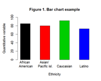
Bar charts have been widely used in illustrating the relationship between a categorical (nominal or ordinal) independent variable and a dependent quantitative variable (e.g., weight, blood pressure, etc.), which is naturally measured as a number. Bar charts can be horizontal or vertical. For a horizontal bar chart, the categorical variable is placed on the horizontal x-axis; thus each bar represents one category of that variable. The height of the bar represents the value of the corresponding category. Figure 1 is a demonstration of how to use a bar chart to compare the difference of ethnicity on a quantitative variable. By placing ethnicity, which is a categorical variable, on the horizontal x-axis, we can visually compare the value of the quantitative variable across ethnic groups.
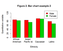
Bar charts can also be used for presenting more complex comparisons. In the above example, if we were to present males and females separately in each ethnic group, then a grouped bar chart can be used with two bars representing males and females within each ethnic group (see Figure 2).
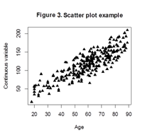
In situations in which both the independent and dependent variables are quantitative variables, a scatter plot would be a good choice to present the data. Scatter plots can demonstrate various kinds of relationships between two variables, e.g., the positive or negative linear correlation, as well as more complex non-linear relationship. Very often, the independent variable is placed on the horizontal x-axis and the dependent variable on the vertical y-axis. Figure 3 demonstrates the relationships between age and another quantitative variable using a scatter plot. Sometimes a line of best fit can be superimposed on the plot to help visualize the relationship between the two variables. And scatter plots become especially powerful and convenient when the relationship between the two variables is not linear.
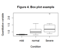
A boxplot is a convenient way to depict quantitative variables through their quartiles. Without having to make any distribution assumptions, a boxplot can display the degree of dispersion and/or skewness of the data. In addition, a boxplot can also help identify outliers. Figure 4 is an example of a boxplot. The bottom and top of the box are the first and third quartiles, and the band inside the box is the median. Also, the low and high ends of the whiskers are the lowest value within 1.5 Inter Quartile Range (third quartile minus first quartile; IQR) of the first quartile, and the highest value within 1.5 IQR of the third quartile, respectively. In addition, the observation above the high end of the whisker for the severe condition is a potential outlier.
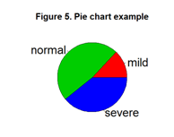
Although less popular, a pie chart provides a simple way to graphically present the relative proportion of mutually exclusive categories. However, it should be mentioned that a pie chart is more meaningful when the sum of all categories adds up to 100%, and small categories are properly combined. Still, one disadvantage of a pie chart is that it is less effective in making comparisons. For example, in Figure 5, it is hard to visually compare the size of the two slices in green and blue.
Tables are used primarily to present raw data, summary statistics, and derived statistics. A one-way frequency table is commonly used to show how frequently the values of a variable occur in a data set. When needed, tables can be expanded to two-way or even multi-way tables to allow for in-depth data analysis.
When the interpretation of the absolute numbers in a one-way frequency table is not intuitive, adding a second column to show the percentage distributions of the numbers is a good idea. A two-way table allows organizing data for two variables at the same time. For example, Table 1 is a simple form of a two-way contingency table, and it allows us to see that there are more females than males in the study, and more females had severe conditions than did males. However, in order to make a conclusion on whether females are more likely to have severe conditions, a formal statistical test has to be performed.
Table 1. Patient condition by gender
| |
Mild |
Moderate |
Severe |
Total |
| Males |
35 |
43 |
23 |
101 |
| Females |
55 |
44 |
33 |
132 |
| Totals |
90 |
87 |
56 |
233 |
Tables can also be used to present statistical test results including p-values. For example, results for testing whether gender, ethnicity, and age group are associated with high blood pressure (dichotomized) can be presented in a single table. Based on the p-values calculated, it is straightforward to make comparisons and conclusions.
There are many advantages of using figures or tables to present your results. However, it is important to understand that figures and tables are most effective when used properly, and every figure and table included in a report has to be referred to in the text. Therefore, careful consideration should be taken to ensure that figures, tables, and text are appropriately used, so that your results are presented in a way that is easily understandable by your readers.
References
- Mendenhall W, Beaver RJ, and Beaver BM. Introduction to Probability and Statistics. Pacific Grove: Brooks/Cole Publishing. 2003. 11-19. Print.
- Minter E and Michaud MUsing Graphics to Report Evaluation Results. University of Wisconsin Cooperative Extension. 2003. Available at http://learningstore.uwex.edu/pdf/G3658-13.pdf.
- Peck R, Olsen C, and Devore J. Introduction to Statistics and Data Analysis. Pacific Grove: Brooks/Cole Publishing. 2001. 121-151. Print.
...................................................................................................................................................................................................................................................................................................................................
Published electronically: 10/15/2013
Conflict of Interest Disclosures: None
Return to top